
Retro//Reflection - Issue #18
Aerochromified - playing around with an infrared film style simulation

Once or twice per month I send out a letter with a handful of (my) photographs and share a bit of insight on the ‘why?’ or ‘how?’. As an enthusiastic photographer, anything goes.
Maybe you learn something?
Or perhaps it will spark some inspiration?
Sometimes a photo can show you things we humans can’t see …
I think by now you all have seen photo’s with a predominant (fluorescent) red color that don’t make sense. At least at first, but when you dive into this it’s all about recording (near-)infrared light. In the analog film world this is best known as using Kodak’s Aerochrome film - a film emulsion that is sensitive to this near-infrared light.
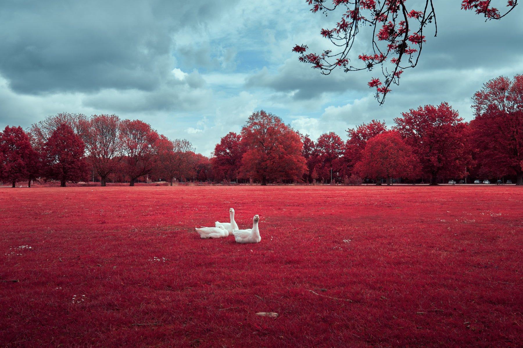
I won’t go into the technical details, there’s already lots to read and learn about infrared (IR) film elsewhere, for example at Analog.cafe. In this Retroreflection I just want to show you some of my photo’s processed with an Aerochrome film look.
Wait, “look”?
Yeah because, well, for one Aerochrome film is no longer produced1 and more importantly, I shoot in digital. Photo’s are edited to my taste, so my best guess is that it doesn’t truly represent what the actual Aerochrome film would have looked like, but I’m not too fussed about that …
So how did you get this look? I can’t find the slider in [enter photo editor here].
To get this specific look you need to do quite some photo manipulation, but to make things easy some photo editors can do things like Presets or Styles. I processed these photo’s in Capture One and used the Aerochrome-16 Style created by London-based art & technology company Really Nice Images (RNI). RNI provides a free Demo Pack which includes this style, so if you want to have a go, I’ll link to it at the end of this letter2.
By the way, if you want to know more about how to install and/or how to use this Style in Capture One, feel free to ask. I could write a separate article about how to process these photo’s; I don’t do much but I do some specific tweaks to get the look I want. I could also do a before-and-after for example.
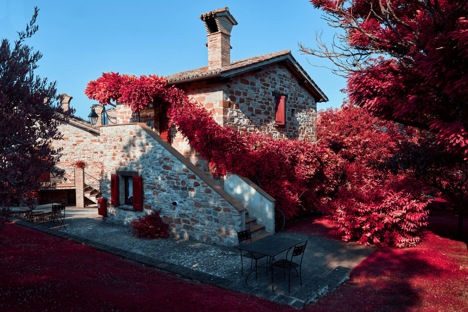
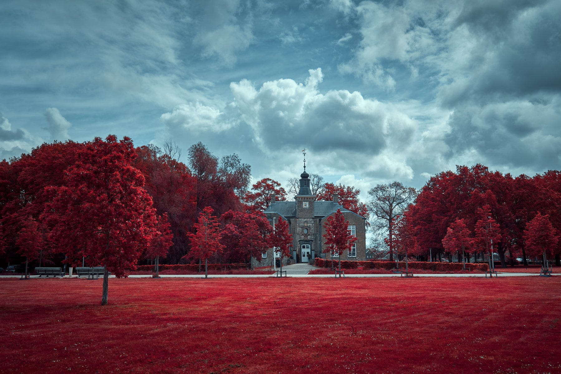
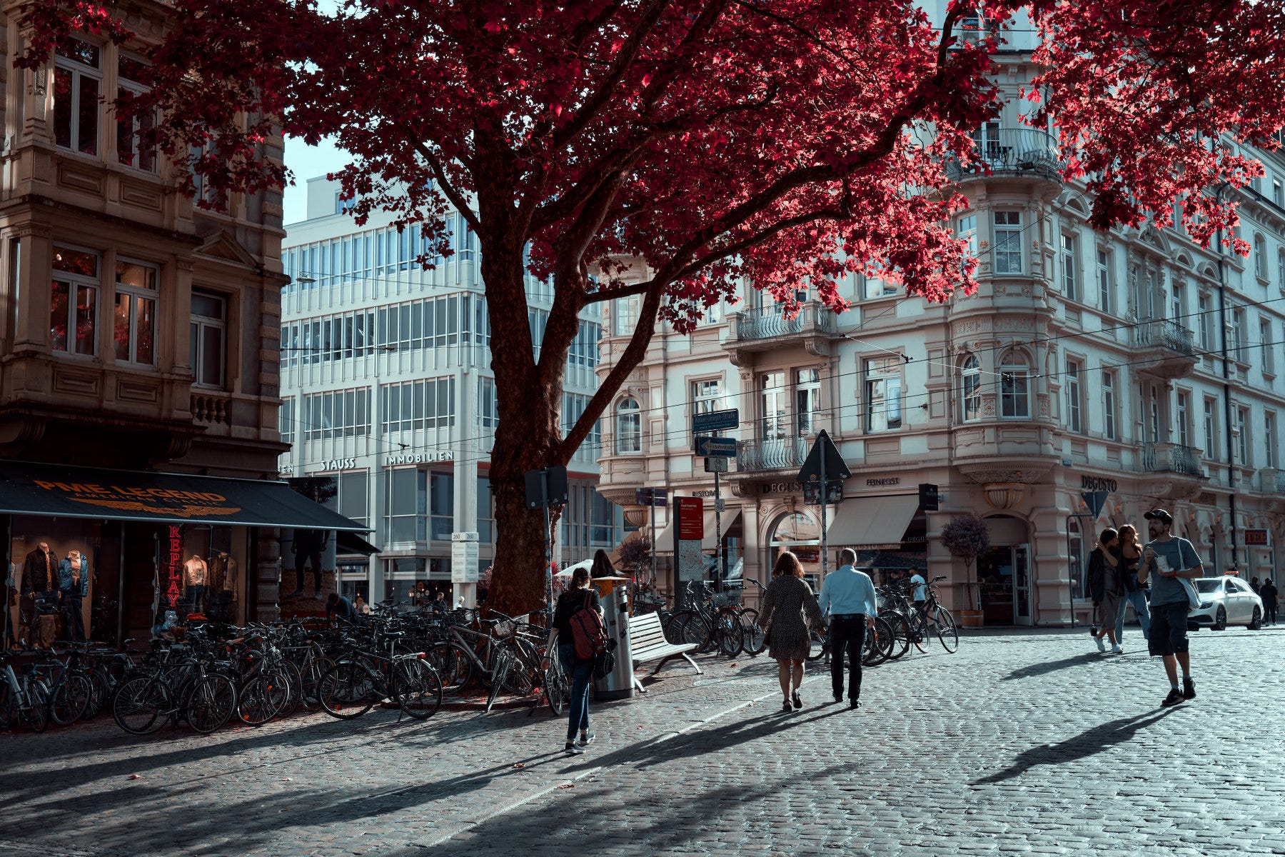
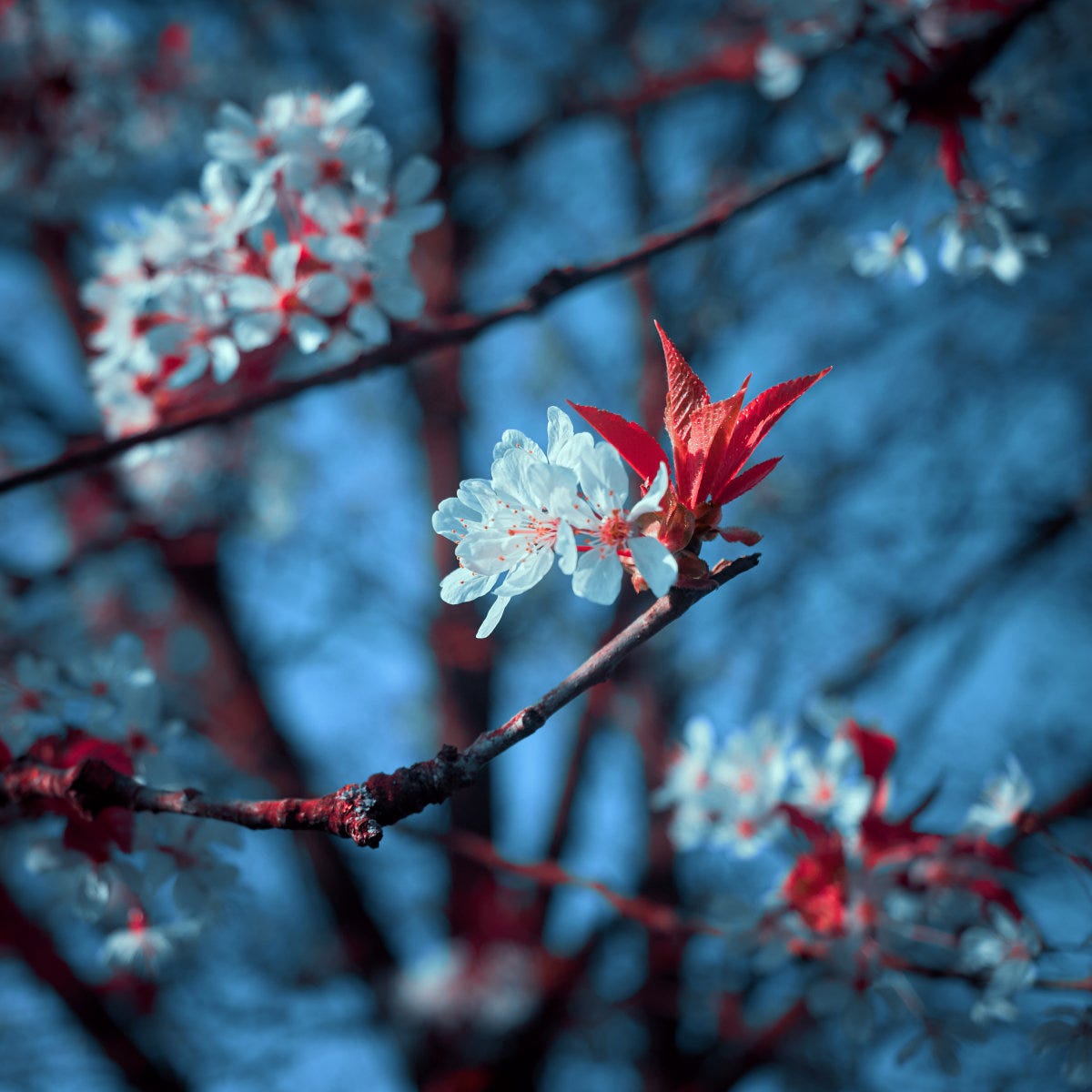
The most obvious choice in selecting suitable photo’s are the ones that have a lot of vibrant foliage, but I also noticed that it can work in different scene’s. It doesn’t always have to be in your face, you know? A bit more subtlety can work too, like the following photo taken in the old city center of Freiburg (Germany):
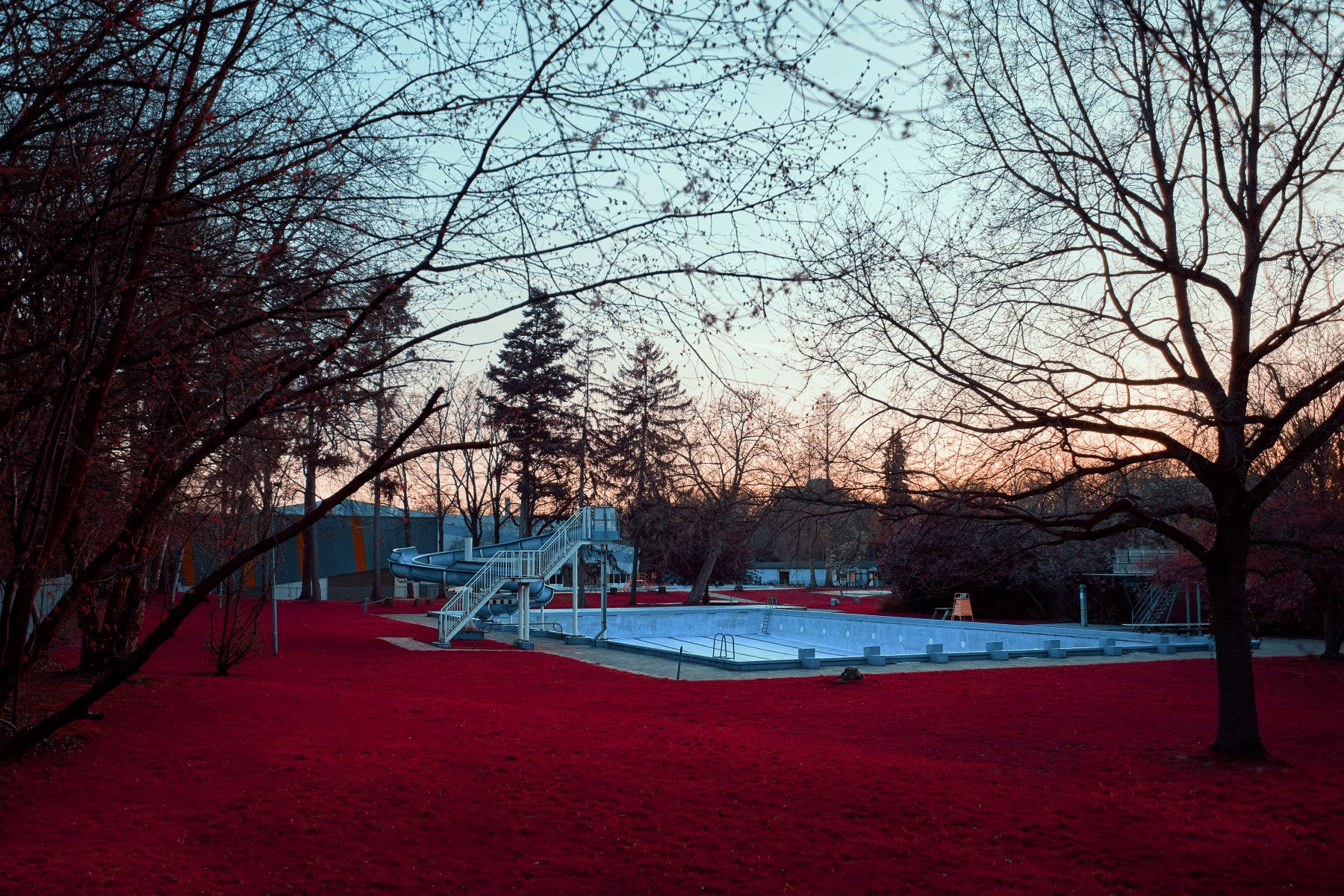
The Aerochrome look is also very suitable to create some eerie looking images. This empty outside pool “Aerochromified” looks like it’s located somewhere near Hawkins, Indiana3 😉.
I’m still going through my catalog of photo’s figuring out what works and what not. It’s a bit hit or miss - it sure does not work on every photo - but often I get pleasantly surprised.
That’s it for this article.
Have you tried Aerochrome or any other Infrared film simulation on your photo’s? Or even better: shot the actual film? Would be awesome to see some of these!
Also have a look at fellow Substackers Xavi and Dan who do (digital) IR photography as well, they’re awesome:


Each issue I want to end with mentioning a photographer, a photography-related website or publication, simply to show my appreciation for what they do. This time: Really Nice Images (RNI).
Here are the links to the Free Demo download (Capture One or Lightroom) of their All Films 5 pack:
https://reallyniceimages.com/products/rni-all-films-5-demo-for-capture-one.html
https://reallyniceimages.com/products/rni-all-films-5-demo-for-adobe-lightroom.html
That’s it for this issue. Thank you for reading until the end. Feel free to leave a short comment or message. Appreciate it!
Until next time, cheers,
Ronald
ronaldsmeets.info
ps: this article/newsletter/post is free, because I’m not doing this to make a profit. Also, I don’t like subscriptions at all (Tom Pendergast has a great article about not going paid, which I agree with). However, if you do want to show your support, a coffee always helps me writing and posting here ;-)
And if you would still find some, I think it’s more expensive than gold :)
There’s also a Lightroom / Adobe Camera Raw version available.
My Stranger Things reference :)
Love these
Great set, those colours are 🔥!