
Retro//Reflection - Issue #23
Let me show you a couple of photographs printed by Saal Digital (Part 1 of 2)

Once or twice per month I send out a letter with a handful of (my) photographs and share a bit of insight on the ‘why?’ or ‘how?’. As an enthusiastic photographer, anything goes.
Maybe you’ll learn something?
Or perhaps it will spark some inspiration?
One of my long-term goals is to actually print my photographs. I’m not there yet to go down the rabbit hole in getting myself a photo printer as I print far too little (and prefer a book format over single prints really), so for the time being I stick to using printing companies.
I ordered at a few different companies in the past, but the last couple of times I ordered prints at Saal Digital, a German printer that delivers all over Europe and Northern America.
A while ago we ordered a bunch of family pics at Saal, and I added some of my photographs as well to have them printed in different formats, paper and sizes, just to get an idea of what works, what not and to get a feel for what I like and don’t like. I have done this a couple of times in the past and I find this has a few added benefits:
If you stick to a handful of photographs, it’s not that expensive - at least not as expensive as a 100-page one-off photobook or investing in a printer and a whole lot of paper and ink just for testing :)
Sure some may not look that good, for whatever reason, but often I end up with pretty nice prints!
… and the ones that don’t look good, I can learn from.
Typically after receiving the prints I do a little ‘assessment’: how do the prints look, are they too dark, too light? How are the colors, do they match (somewhat) with what I see on screen? How does the paper feel, do I think it suits the photo?
In this issue I want to share this assessment with you (well, it’s more like writing down some observations and impressions really). Since I want to keep my posts as manageable as possible, I will split this in two parts. I’ll start with a few basics on how I prepared my photos for print and discuss one set of prints from Saal. In Part 2 I’ll show two other sets of prints.
Before we continue a couple of things you might want to know …
I edit my photos on a general purpose (as in: non-photography-specific) sRGB monitor1, but I have calibrated it using a display colorimeter2 and based the calibration on a white balance of 5000K (daylight) and a luminance of 120 cd/m^2.
However, when looking at the prints I don’t really care that much for color accuracy - as long as there is no apparent color cast - since I didn’t do any proper soft-proofing with the paper ICC profiles (which you can download ofcourse). But I do check that the prints don’t look too dark or too bright.
I view the prints in normal daylight without direct sunlight hitting them. If it’s too dark outside, I’ll view the prints under a (LED) ceiling lamp set to the coolest white value possible (which is probably around 4000K, so still not really ‘daylight’)3.
Know that I’m not too scientific about all this, because in what world do people look at prints in a fully defined (“ideal”) environment anyway, right?
Finally, Saal has it’s own “Saal Digital Design Software” which I used to add some elements to photos or to do a minor “soft proof correction” (I’ll explain later). I also used it to actually place the order and to send the files over.
So with that out of the way, let’s get to the point of this issue of Retroreflection. I ordered 3 type of prints: Postcards (which I will discuss below), Art Print and Retroprint (both will be shown in Part 2).
Postcards
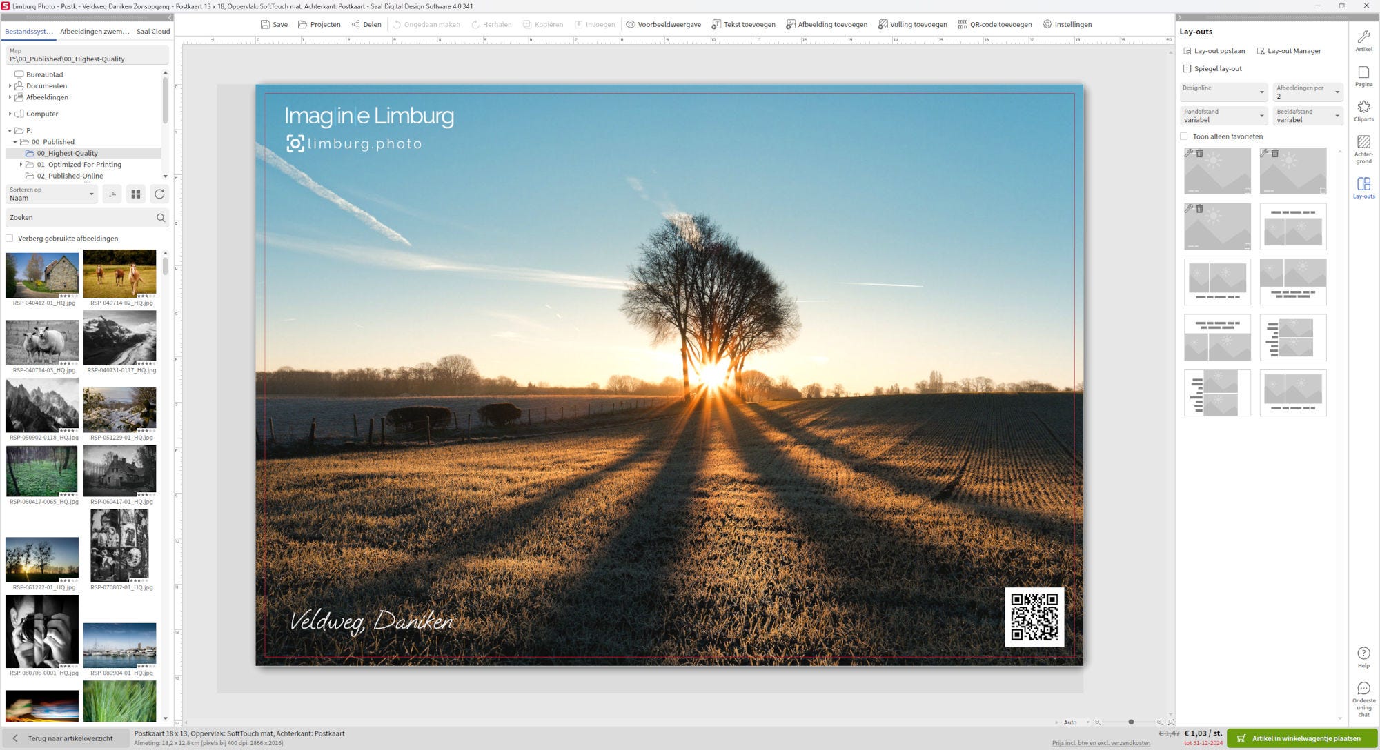
To begin with the postcards, I selected three photographs of Limburg which I published for my Imagine Limburg project (read about it in Retroreflection #4).


In the design software I added a logo, some text and (on one of the designs) a QR-code linking to the https://limburg.photo website. In the software I increased the Brightness between +1% and +5% (depending on the image) to prevent the print looking too dark compared to what I see on screen. On one occasion I also increased the Contrast to +30 (in whatever scale that is because I could go from -200 to 500 🤔).
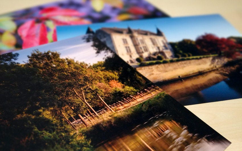
Photos are printed in 13x18cm (5x7 inch) on what Saal calls “SoftTouch” matte paper. On the back there is a template with space to write text, the destination address and to add a stamp. One disadvantage is that you cannot seem to edit this back side; it would be nice to add some additional text there, for example.


I think the photos all look very good, and it’s definitely matte paper - there’s no shine (which I quite like). The paper feels thick enough to be send by post4.
The autumn path (“Danikerbos”) and sunstar (“Veldweg, Daniken”) photo both look a little more orange/red (warmer), but there’s no apparent color cast. Brightness is also fine in all three, none of them look too dark. However, the snow covered lonely tree photo (Daniken) is my favorite, it looks absolutely awesome5.
By the time of ordering Saal had a promo on postcards, I ordered 3x10 cards and paid € 0,90 per card (normally € 1,29 per card). I think 90 cents per card is acceptable, but I wish it would be possible to customize the back side of the card. So if I ever think about selling postcard sets, I’ll probably look elsewhere.
Nevertheless, I’m pleased how they turned out.
That’s it for Part 1! Look out for part 2 next week :)
Have you ever ordered at Saal? What was your experience?
Each issue I want to end with mentioning a photographer, a photography-related website or publication, simply to show my appreciation for what they do.
So far I’m happy ordering at Saal, so one more time here’s a link to their website. That’s enough free promotion for them ;-)

That’s it for this issue. Thank you for reading until the end. Feel free to leave a short comment or message. Appreciate it!
Until next time, cheers,
Ronald
ronaldsmeets.info
ps: this article/newsletter/post is free, because I’m not doing this to make a profit. Also, I don’t like subscriptions at all (Tom Pendergast has a great article about not going paid, which I agree with). However, if you do want to show your support, a coffee always helps me writing and posting here ;-)
Philips Brilliance 272B, 2K, 27”
This one to be exact: https://www.xrite.com/service-support/product-support/calibration-solutions/colormunki-display . You can get the latest one via Calibrite: https://calibrite.com/us/product/display-pro-hl/
I’m still considering getting an actual daylight temperature light source. But like already mentioned, I don’t particularly care if the prints look *exactly* the same as on screen - they are different mediums so some variation is allowed.
Care to do a test? Buy me a coffee at https://ko-fi.com/ronaldsmeets, send me your postal address and I’ll send you a card!
Ssht … don’t tell anyone but this is a smartphone pic :-)
Saal has a paper sample package which you can order from them, which is very helpful choosig the right.
I really like that first image labelled Veldweg, Daniken. Right up my alley is that one.
I have recently started making my own prints and the quick feedback this gives me is very satisfying. My plan now is to print, print and print some more this year. I have a lot to learn and I know practice is the only way to get there. Like you, I'm not sure I will be the sort to print all the time, so I was looking for a printer that didn't have to be used every day just to survive. This is the promise of the Epson Ecotank 8550, which I am told can sit for weeks without the print head drying out. We shall see. I have already begun thinking of 2025 as the year of the print and my last two substack posts have been on that topic.
I used to be quite disappointed by prints I ordered online until one day I read that to get more realistic results, turn the brightness of your monitor down by half. This better mimics the way light reflects off paper rather than the backlit screen look which no paper can reproduce. With my expectations adjusted in this way, I began to see why I was not getting the results I thought I should. Setting the screen brightness to 50% really helps previsualize the print and lowers one's expectations of what is possible. I haven't printed regularly since the seventies when I had a black and white darkroom. I also printed some cibachromes back then, rolling the colour prints in a plastic drum to wash the prints.
Once I moved to the country however, I could no longer afford the water needed to properly wash negatives and prints. Neither did I want to toss my spent chemicals into my septic system, so I just gave up on printing. Digital printing is bringing me back to the full circle of photography I enjoyed in my youth.