


Retro//Reflection - Issue #24
Let me show you a couple of photographs printed by Saal Digital (Part 2 of 2)

Once or twice per month I send out a letter with a handful of (my) photographs and share a bit of insight on the ‘why?’ or ‘how?’. As an enthusiastic photographer, anything goes.
Maybe you’ll learn something?
Or perhaps it will spark some inspiration?
One of my long-term goals is to actually print my photographs. I’m not there yet to go down the rabbit hole in getting myself a photo printer as I print far too little (and prefer book form over single prints really), so for the time being I stick to using printing companies.
In Retroreflection #23 I wrote about prints I ordered at Saal Digital. Since I want to keep my posts as manageable as possible I have spread this over two posts, this is Part 2. If you haven’t, I recommend reading Part 1 before continuing:

In Part 1 I discussed Postcards, now it’s time for the Art Print photos and Retroprint photos.
Art Prints
To begin with the Art Prints, I selected five of my “Aerochromified” photographs (you can read about these in Retroreflection #18).


In the design software I increased the Brightness between +5% and +10% (depending on the photo) to prevent the print looking too dark compared to what I see on screen. There’s also a “Optimalization” setting that I always turn off (recommended by Saal if you edit your photographs yourself, which I do)
Photos are printed in 13x19cm (5x7.5 inch) on what Saal calls “Art Print” paper. It’s not very clear what specific type of paper this is while ordering (I took a bit of a gamble here), but if you dig a bit deeper on their website you can find some specifications.
It’s a matte type of paper, has a bit of a cardboard-feel and is quite textured. It’s definitely different to a ‘normal’ photo print (for example the often used Fuji Crystal Archive DP paper). Although I like the results, I’m not sure if the photos/subjects suit this type of paper. Or maybe I’m just not used to this kind of textured paper? I can’t quite put my finger on it (just yet). In terms of brightness, they do look alright. Maybe shadows could’ve been a bit darker, though (next time I’ll download the ICC profile to do a proper soft-proof).
Something I did overlook was the bleed. In the software there is a clear red border indicating the bleed line. For most photos every important part of the composition was well within this region (or I adjusted accordingly) but I failed to notice this with the image of the stone house: the top of the chimney was just too close to the bleed line, and it got cut off right at the top. Lesson learned: always make sure that no important part of the composition is near the edge of the frame! Always keep some space (take one step back or zoom out) and don’t crop too tight at the editing process.
The back side is plain white with the file info nicely printed.


Of each photo I ordered one print for € 0,56 per print, which I find perfectly acceptable.
Retroprint
And finally the Retroprints. I selected six of my “BeyondFocus” photographs (you can read about them in Retroreflection #3), because they are already square format images.
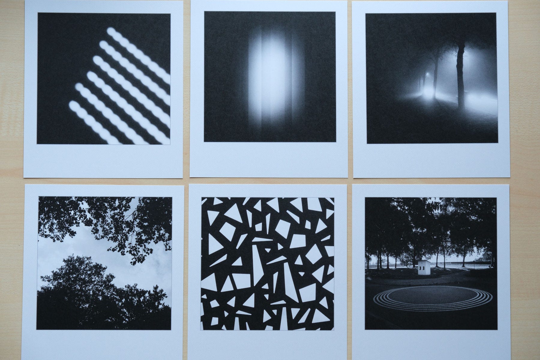
Apart from turning “Optimalization” off in the design software, I didn’t alter these images at all. They are the JPEGs straight from the Lightroom export.
Photos are printed on a 12x14cm (4.7x5.5 inch) card that Saal calls “Retroprint”, obviously trying to make it look like a Polaroid, Fuji Instax or any other instant camera. The actual photo is about 10x10cm (4x4 inch).
Again, from the start it’s not very clear what specific type of paper this is while ordering (they mention “Classic Paper”, whatever that means), but if you dig a bit deeper on their website you can find some specifications. Like all the others, I opted for the matte variation but they also have a glossy version available.


The back side makes it look like it’s an actual instant print - but obviously it is just printed. Yeah … not my thing. In terms of brightness they all look fine. Details are also very good, especially considering these images are all made with my smartphone (which doesn’t have the best sensor in the world).
Of each photo I ordered one print for € 1,00 per print, which I find a bit much. Maybe there’s a discount when ordering more but I would need to check.
Looking at these I think I want to print more of the BeyondFocus collection of images in this format. Maybe make selections / sets / image pairs 🤔.
Summary
Overall I’m pretty happy with all prints. None of them are bad (as in: too dark), print quality looks great. Considering I didn’t do any proper soft-proofing, I’m happy with the colors. Delivery has been fast (couple of working days) and prices in general are not too bad because Saal often offers discount codes, which I used with this order as well.
Plus, I got plenty of inspiration again for a next batch in the future. That said, next purchase will probably be a (small) book (again), because I don’t know what to do with shoeboxes full of single prints 😉1
Anyway, that’s it for Part 2! Hope you enjoyed reading my thoughts and findings and maybe it was of any use. At least for me it helped (again) to dive (well, more of a dip) into the world of printing.
Each issue I want to end with mentioning a photographer, a photography-related website or publication, simply to show my appreciation for what they do.
I’m not going to mention Saal again, but I want to give a shout out to
. Why? Because just a while ago he wrote a really nice piece about Cameraless Photography. Not something I have tried before but I do have it on my endless list of things to try and added this “brief overview” as resource to that list!
That’s it for this issue. Thank you for reading until the end. Feel free to leave a short comment or message. Appreciate it!
Until next time, cheers,
Ronald
ronaldsmeets.info
ps: this article/newsletter/post is free, because I’m not doing this to make a profit. Also, I don’t like subscriptions at all (Tom Pendergast has a great article about not going paid, which I agree with). However, if you do want to show your support, a coffee always helps me writing and posting here ;-)
If you have tips or suggestions, please leave a comment :)
These are great; thank you for sharing them with me!
maybe this post from susanne will help:
https://open.substack.com/pub/susanneh/p/the-fragility-of-life?r=2b8uel&utm_medium=ios
i seen another one on substack made with leaves but i don't remember who post it. i will keep searching